

JUNO the bakery
Simplicity speaks for itself
Client
JUNO the bakery
Industry
Hospitality
Deliveries
- Visual Identity
- Storytelling & Tone of Voice
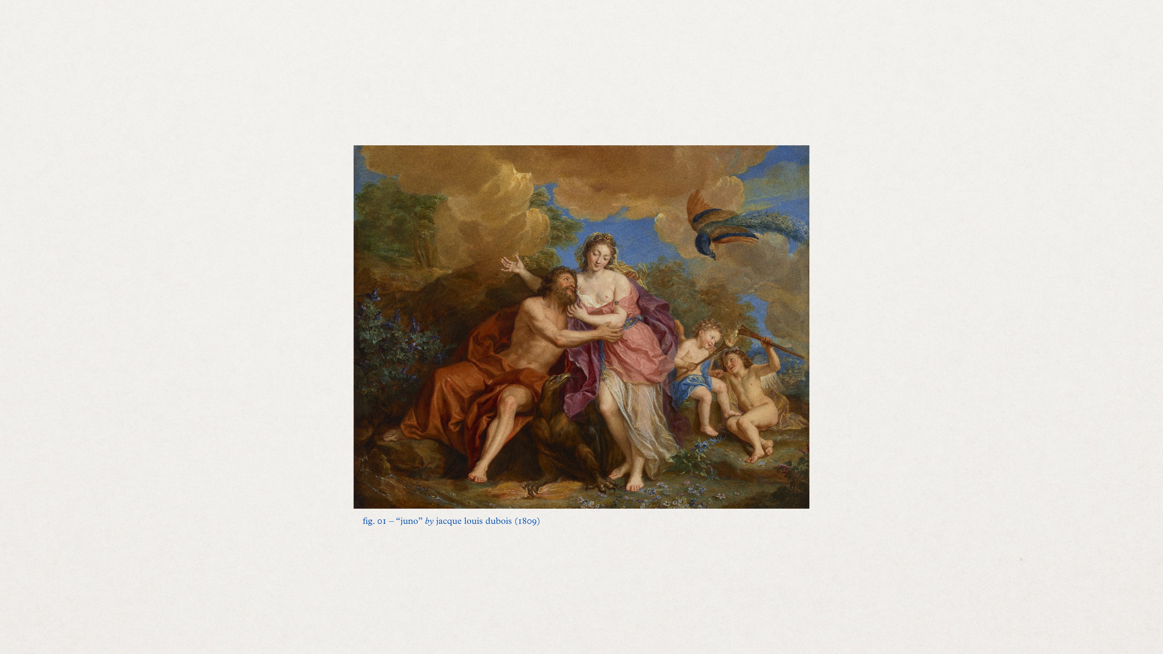
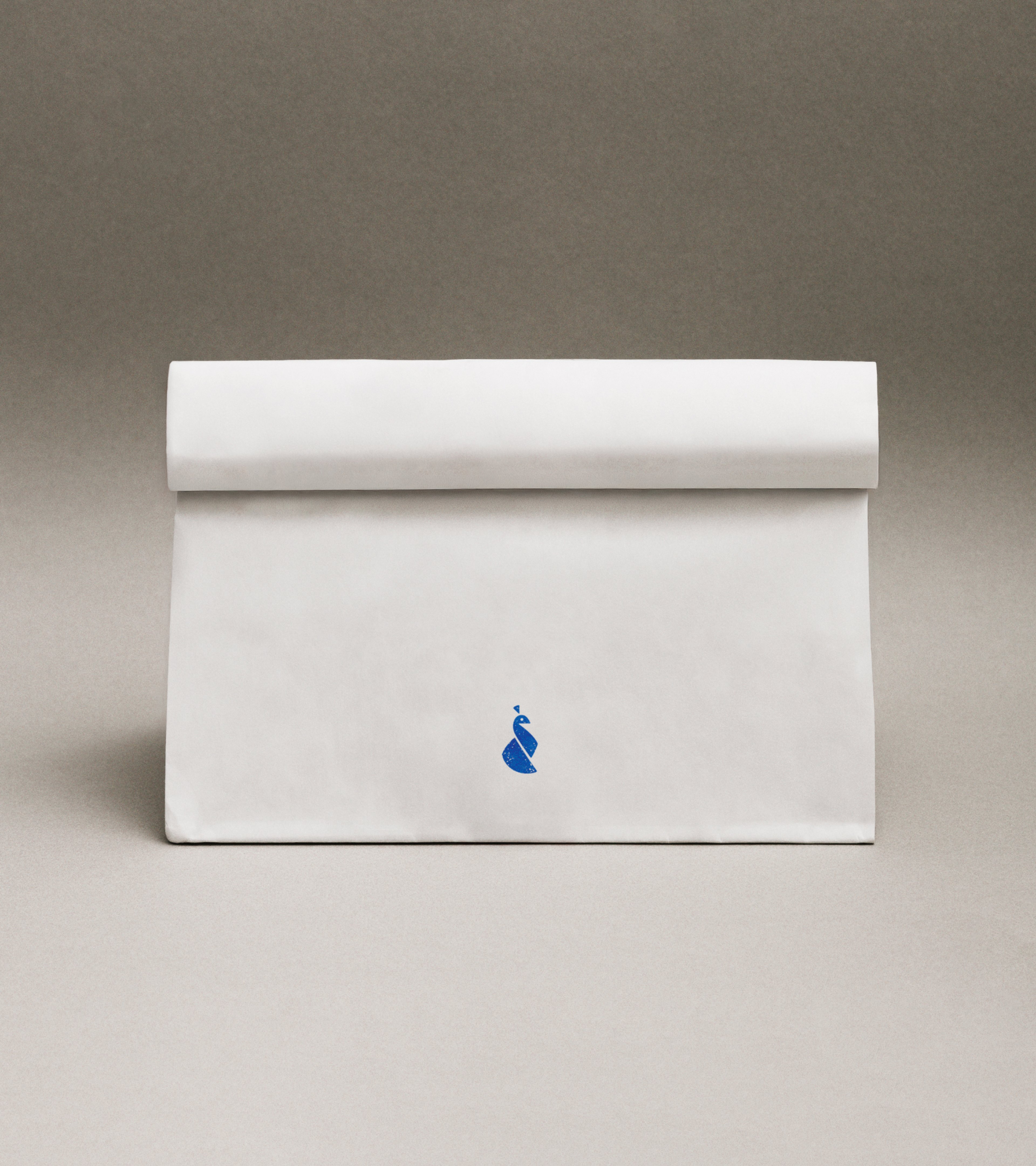
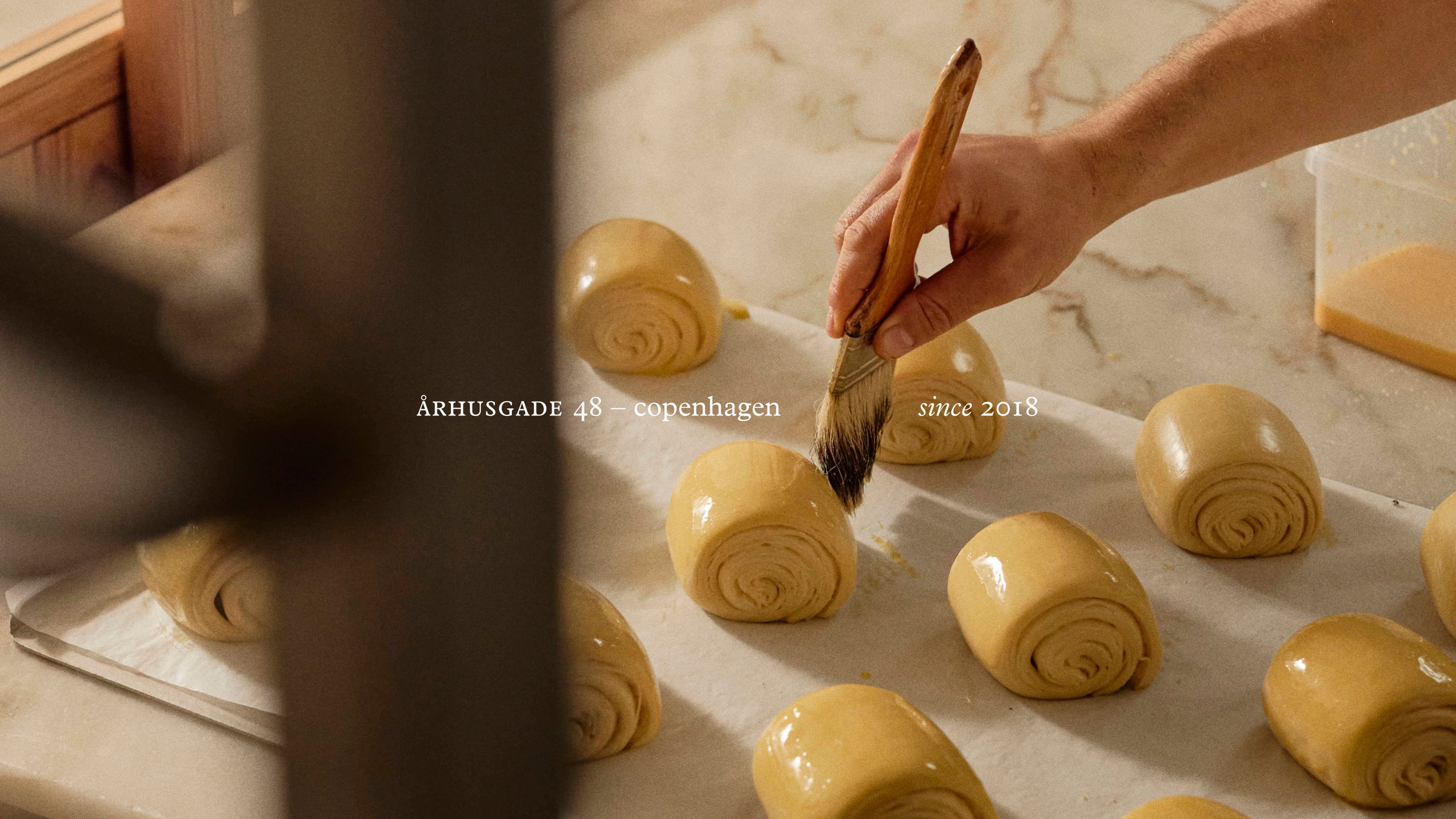
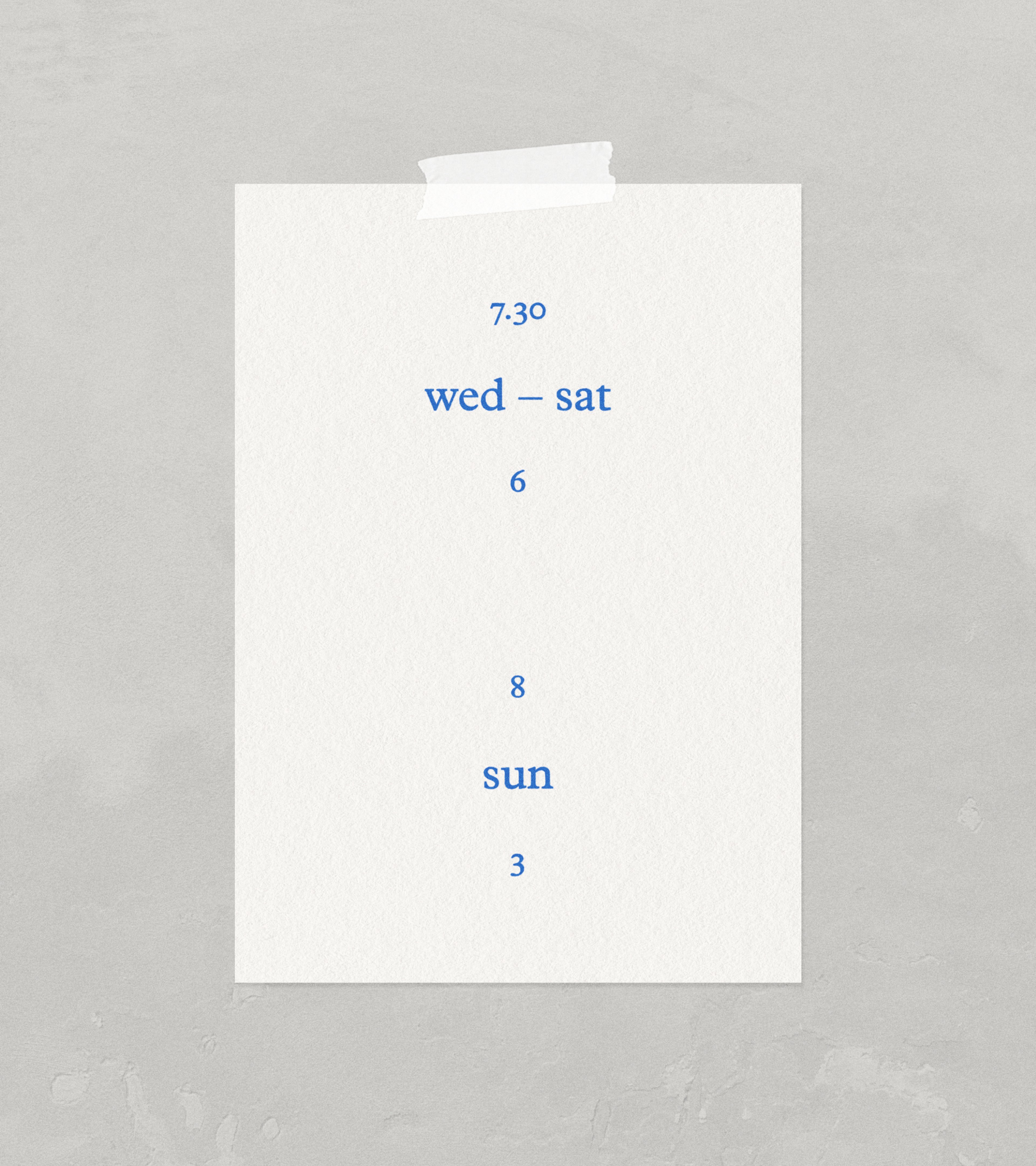
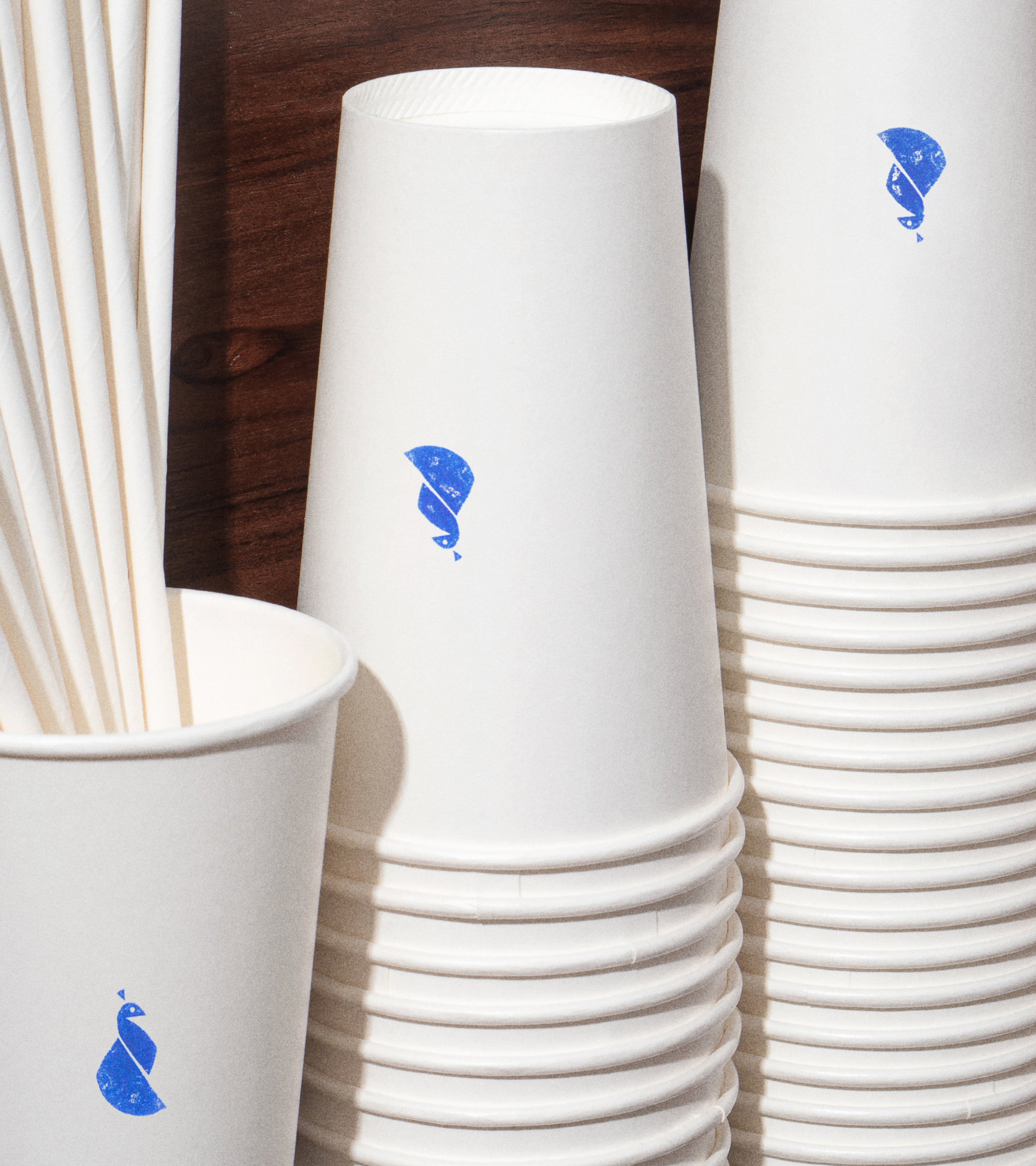
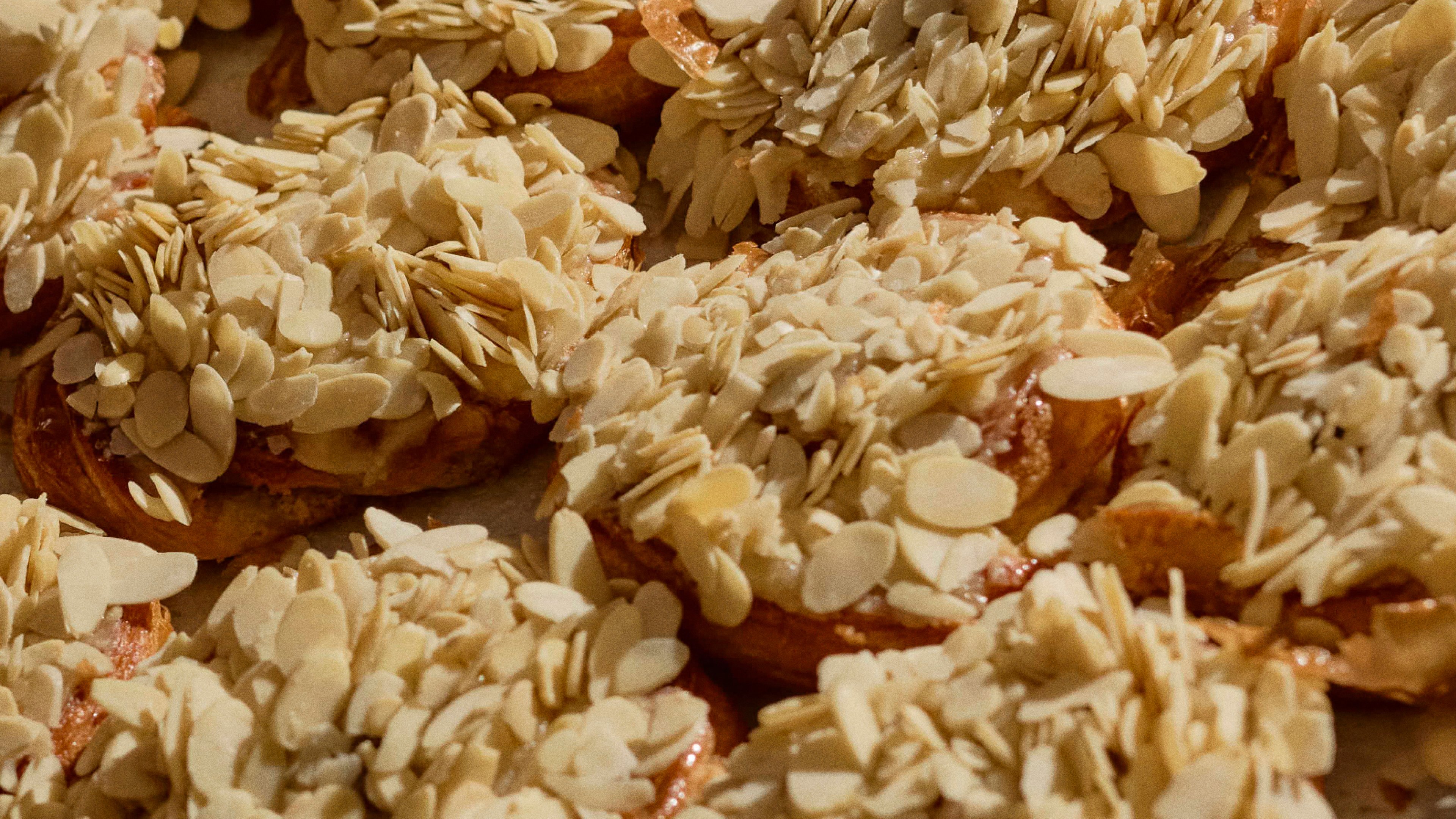
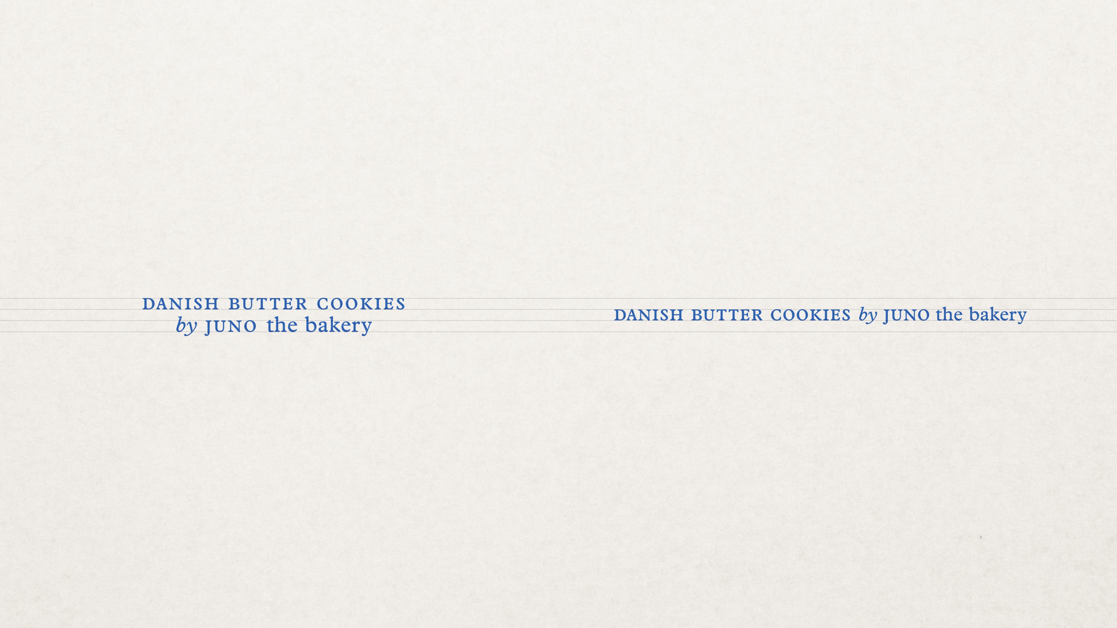
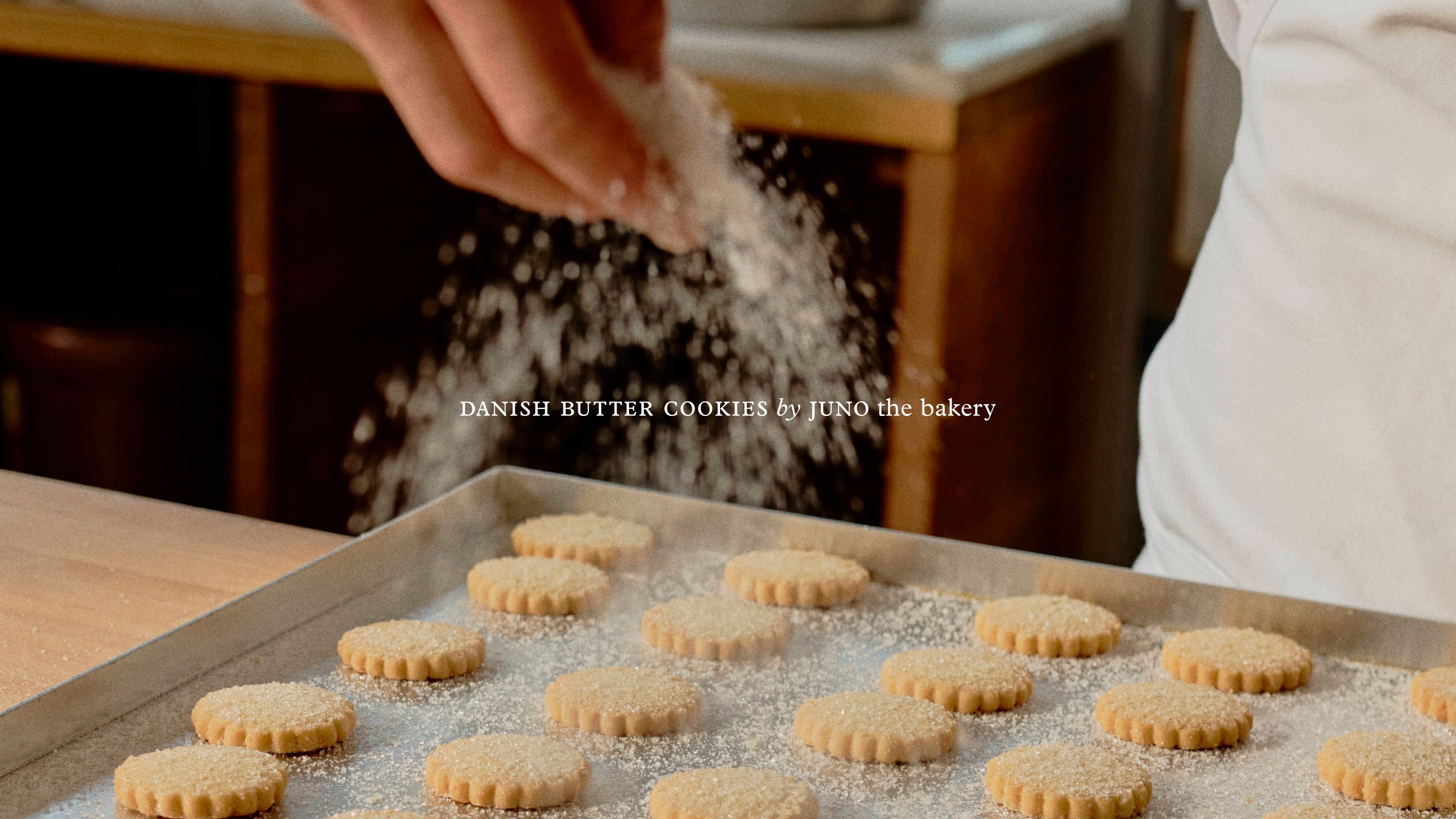
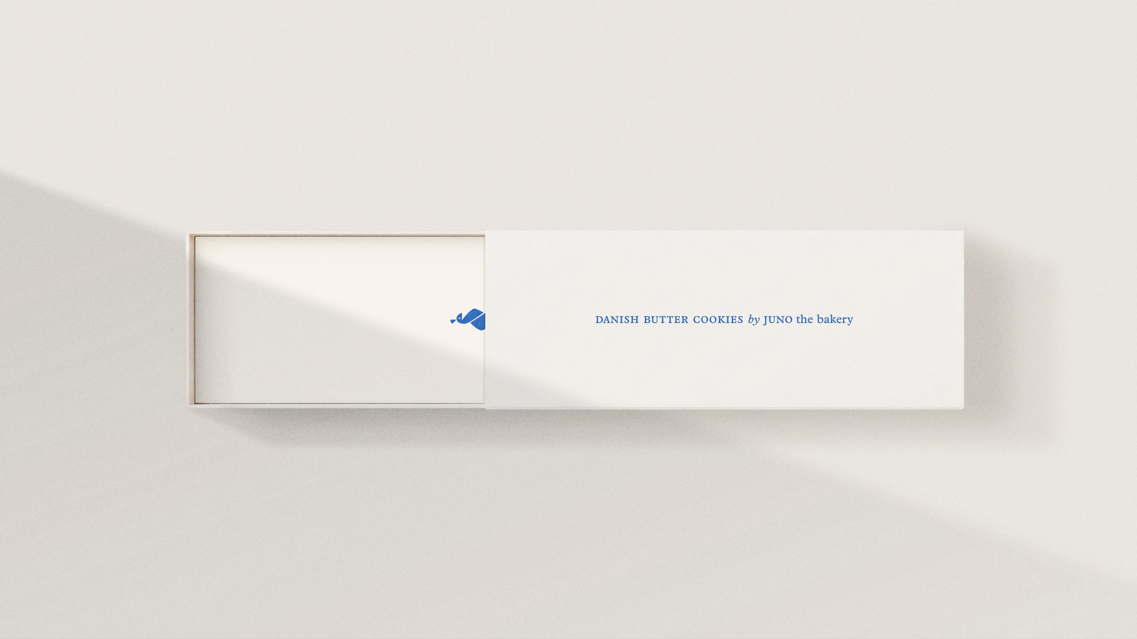
"Copenhagen” is practically synonymous with “bakery.” And JUNO the Bakery is the city’s crown jewel. It’s not for nothing that hundreds of tourists and locals alike line up every day to get a taste of what they’ve got to offer. That's why JUNO's brand needed to stand out just as much as their baked goods. While the rest of the category leans into fairytales, JUNO’s identity rises above. No city skyline, no Little Mermaid, no manufactured hygge. But Copenhagen shines through all the same. Through crafted simplicity, brought to life by subtle hints of blue and small, simple duotone illustrations. And who wouldn’t want to take a bit of that home with them? The most recent addition to the brand universe has been to refine the packaging of their famous butter cookies. Perfected but not flashy, the packaging was designed to reflect their purity. A quiet confidence that what's inside speaks for itself.

Special thanks to


