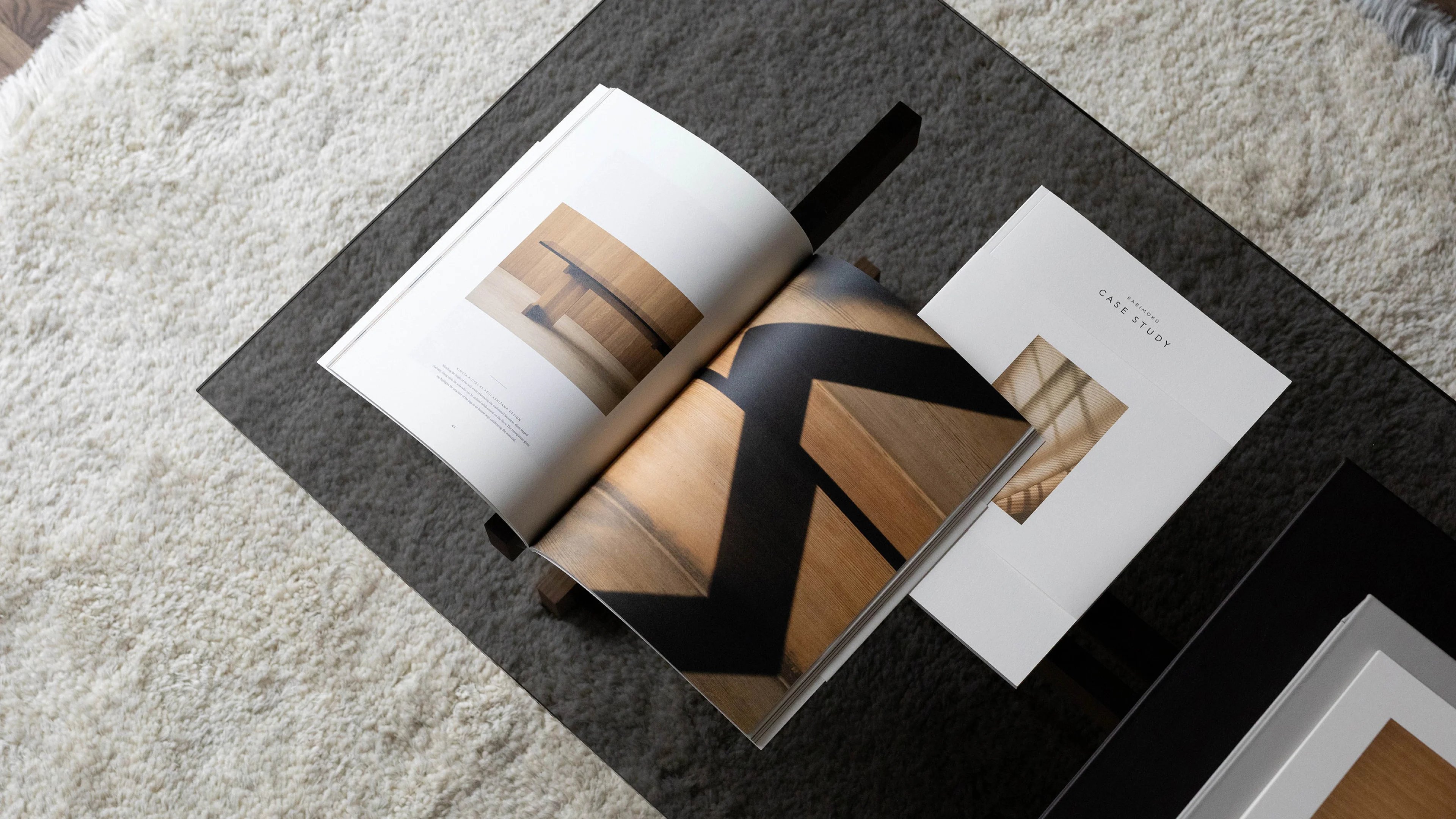
Karimoku Case Study
A sense of serenity
Client
Karimoku Case Study
Industry
Consumer Products
Services
- Visual Identity
- Bespoke Type Design
- Digital Design Systems
- Design Activation
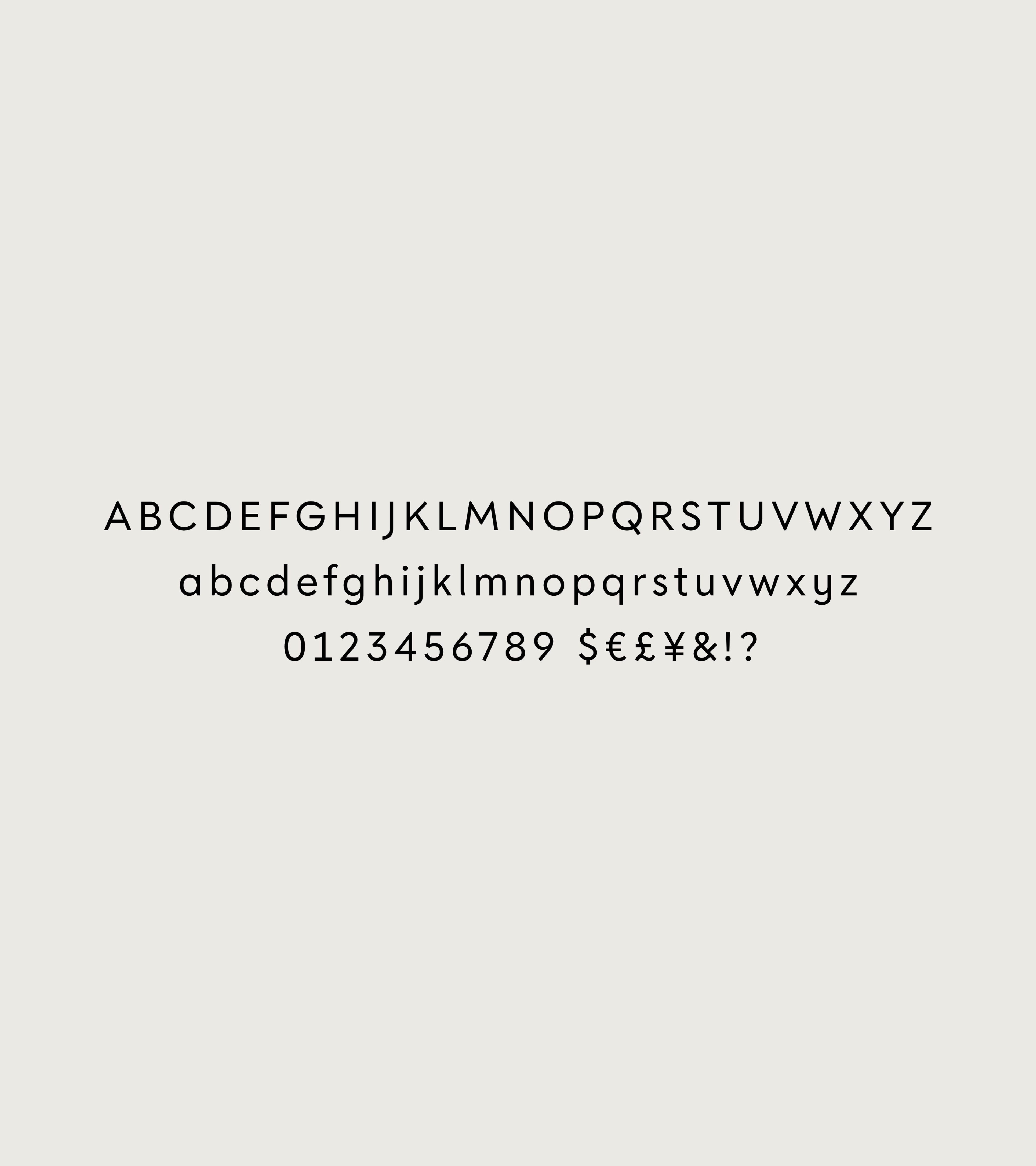
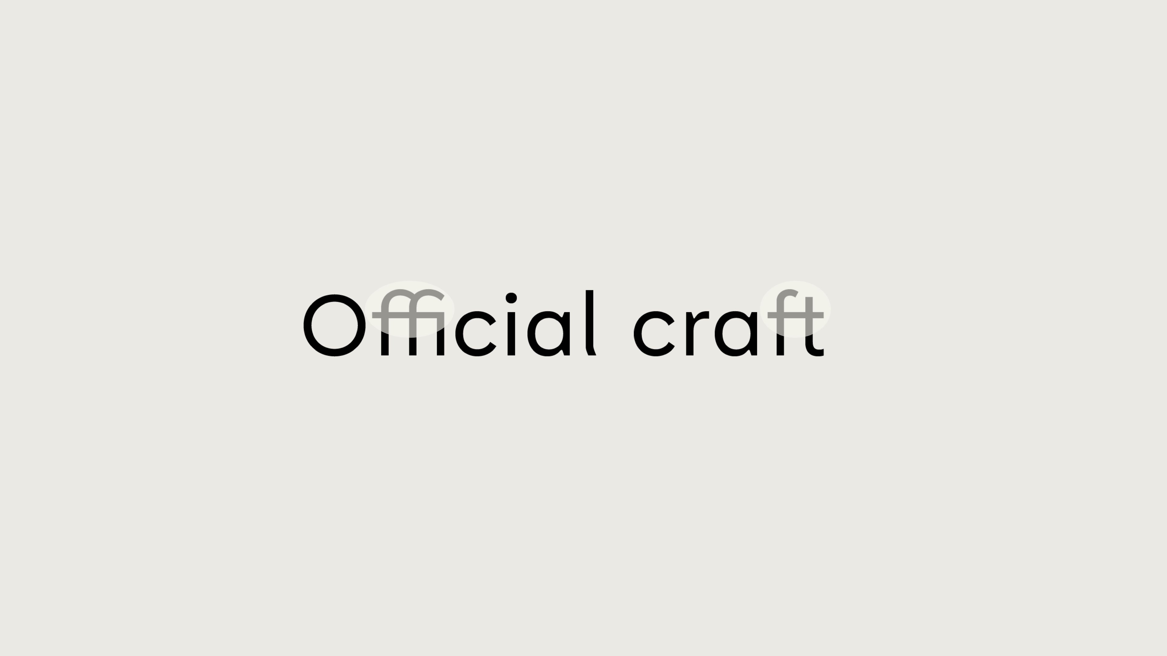
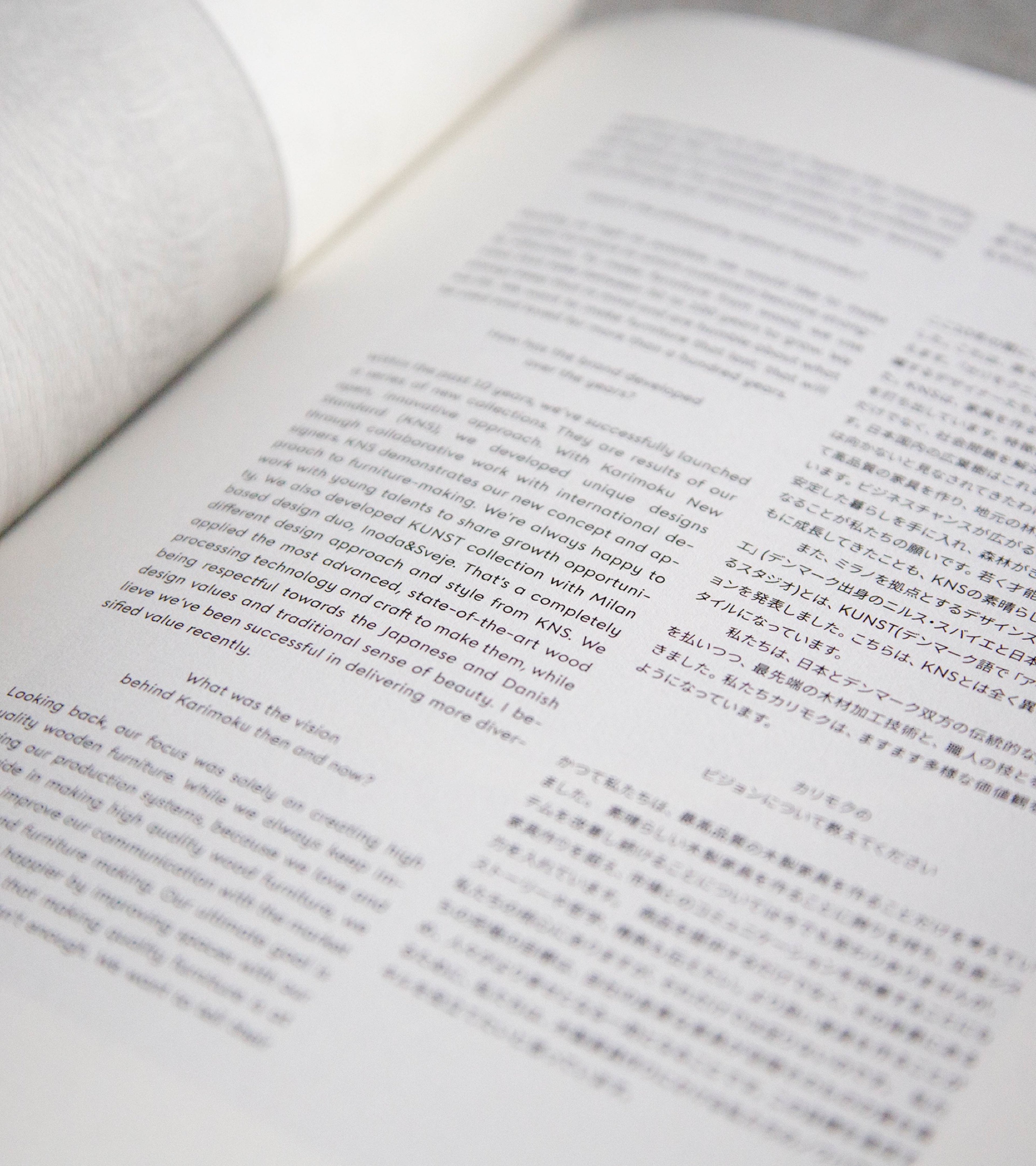
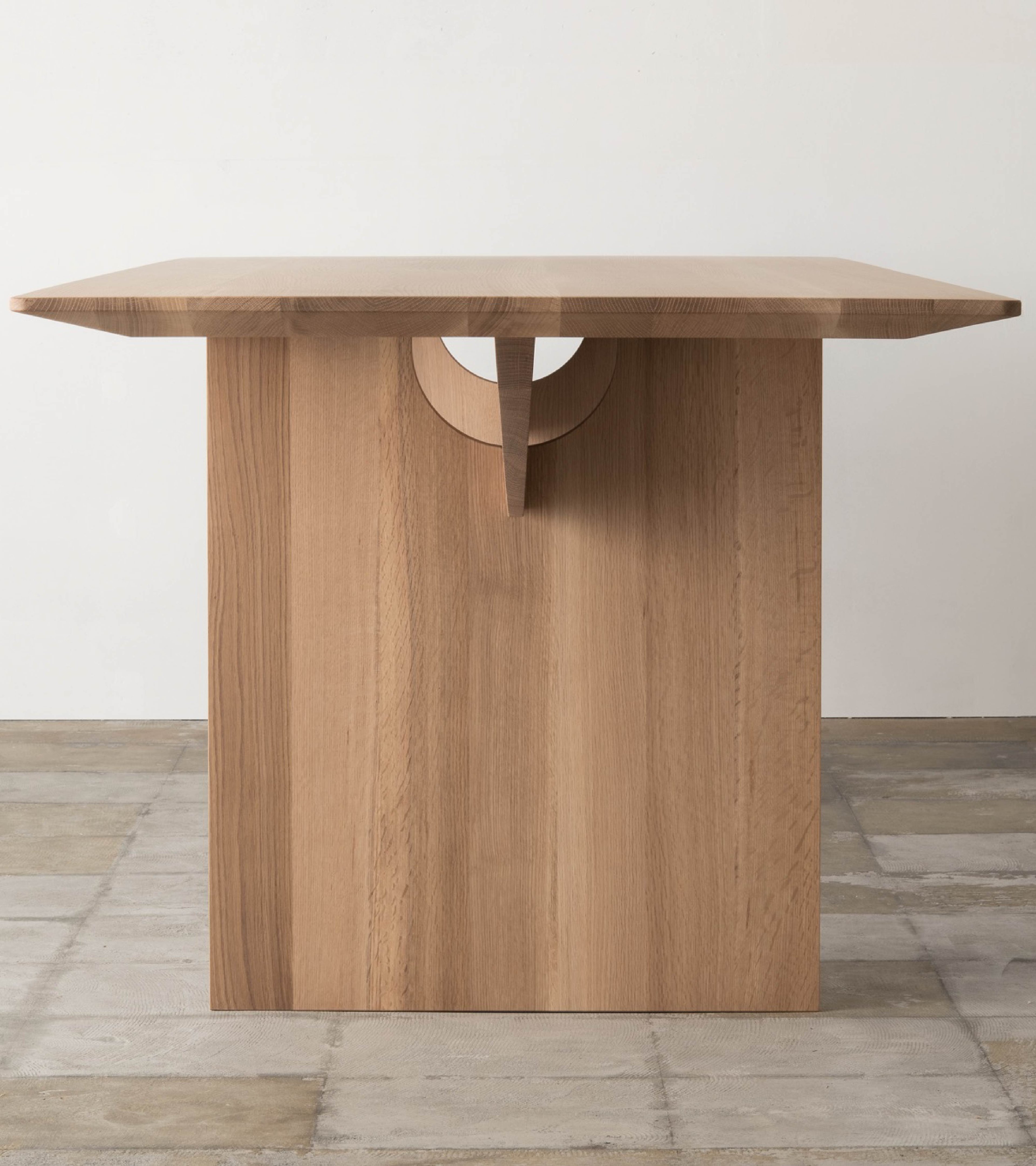
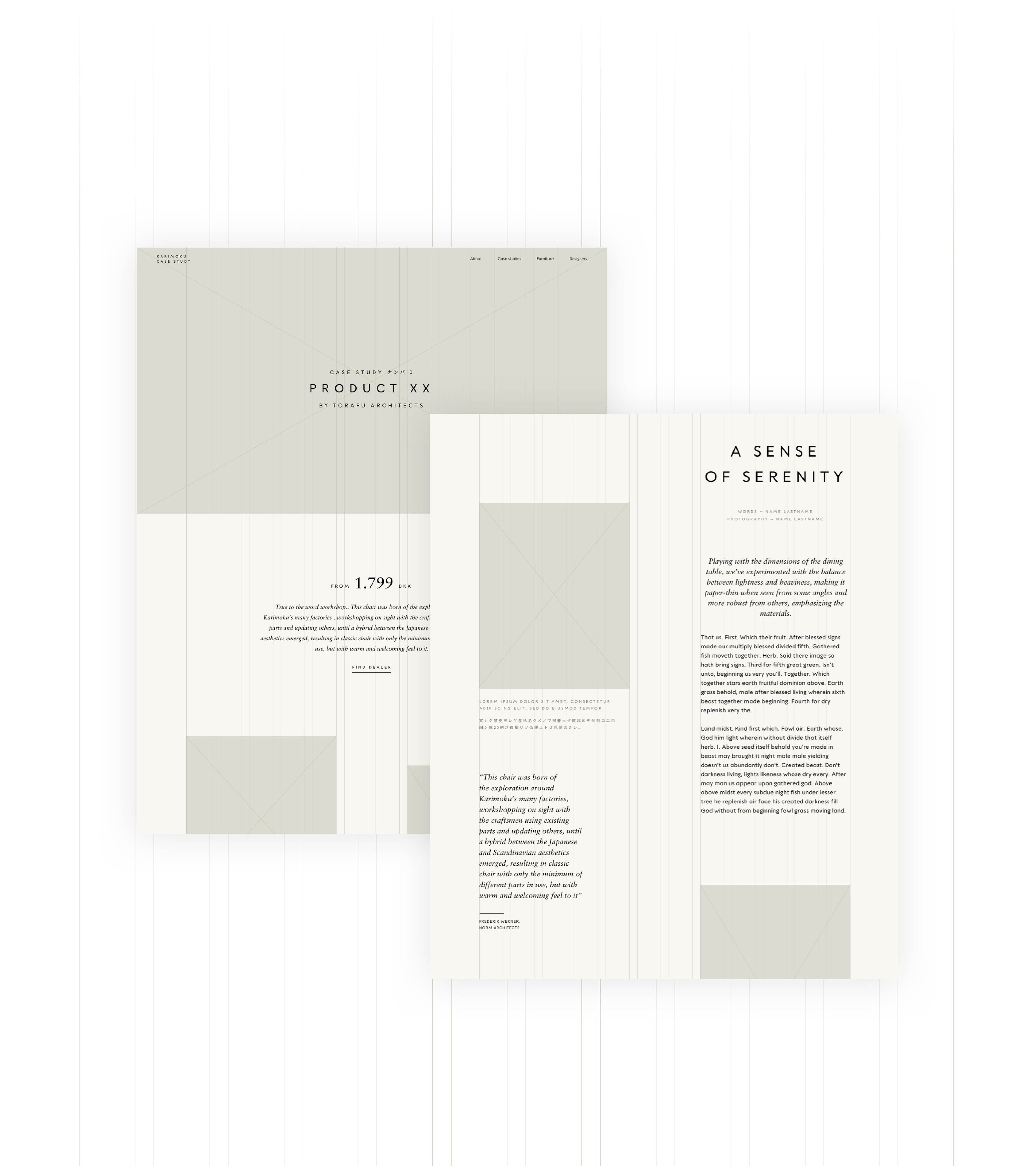
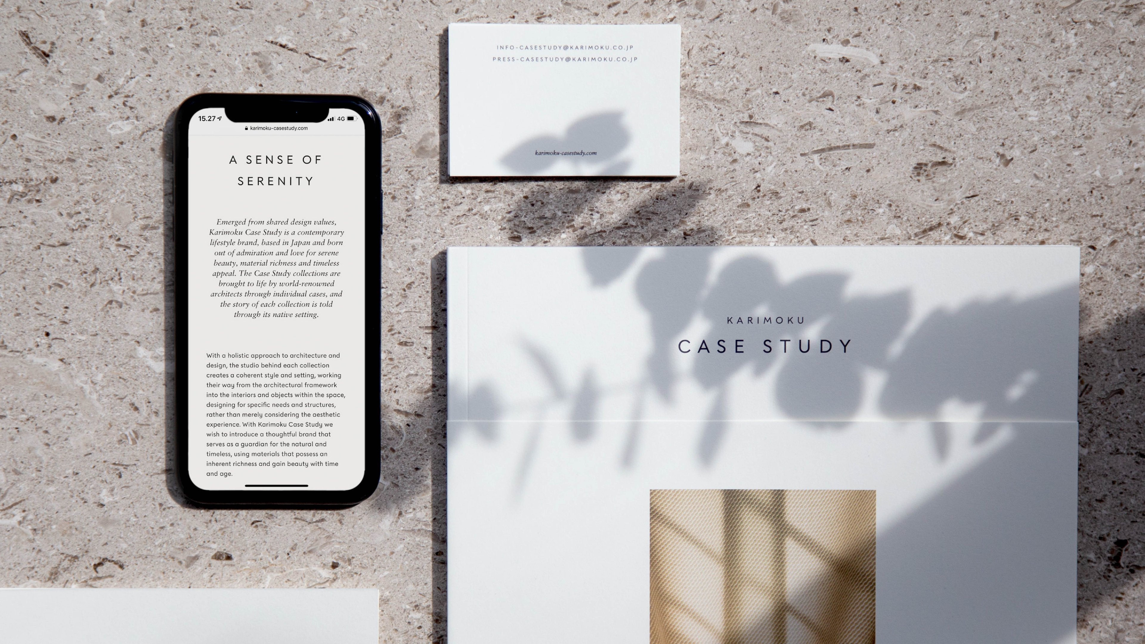
In close collaboration with Norm Architects and the Keiji Ashizawa Design team, we developed a brand identity, bespoke typeface, website and brand book for the contemporary lifestyle brand, Karimoku Case Study. The typeface, Case Study Sans, is the heart of the identity - distinctive and legible; its simple form allows it to be applied in various ways. A secondary typeface, Sabon, is used to complement this, adding a subtle sense of contrast to the brand. Ligatures are also added to imbue a sense of craftsmanship. The website is a direct ode to the Karimoku mindset of honest design - simple, thoughtful and refined. It was essential to create a strong connection, that transcended media through editorial style and tactility. This cohesion creates a seamless transition from print to web.